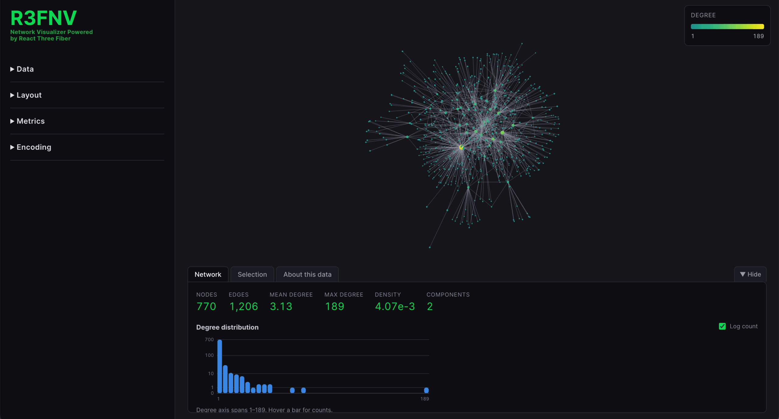
I’ve been increasingly interested in network mapping as an ethnographic technique for uncovering community insights.
There are some very powerful packages out there for creating network maps, but I found many were focused on statistical analysis and unintuitive for more qualitative exploration. Gephi is a great open source tool, but is over-powered for many situations and the interface makes it exceedingly difficult to do simple tasks like accessing the underlying data for any given node.
My goal with this project was to build a lightweight browser-based tool that could quickly map out a network in 3D space and allow easy manipulation and exploration for general users.
Inputting data
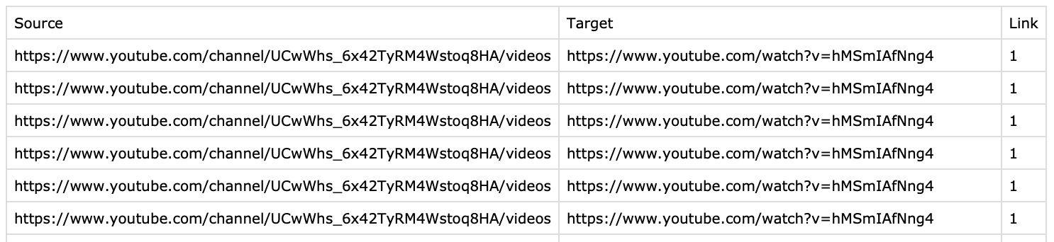
Below is an example of data collected from the youtube channels of Trevor Noah and Bill O’Reilly. I scraped suggested videos from each channel (in incognito mode to avoid targeting) to look at the partisan relationship and reveal what kind of content gets surfaced across party lines.
There are a lot of ways to capture network data, but I feel like node list is the simplest, so for the initial build of my visualizer I only support CSVs in this format.
I also currently only support undirected networks, but have an active branch to add directed support as well, since this is clearly a big limitation for insights.
In addition to CSV upload I added a couple of demo networks of various sizes to show off some of the functionality. I had Claude help me identify these datasets and get them formatted in the node list setup.
Viewing the initial network
Upon initial load, all the nodes (videos) get scattered in 3D space with edges (suggested links) connecting them. A bottom panel reveal some general information about the network like the min/max/average number of degrees (links) per node, and the min/max/average weight per edge.
Revealing insights with spatial options
To really start diving into the network, several options are available that I find to be the most useful for qualitative exploration.
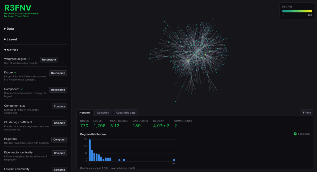
First, you can edit the projection of nodes. Instead of random, you can choose force-directed, either 2D or 3D. This already can give a high level sense of how things are spread out.
Looking closer at nodes
Next, you can assign features to the node size and color. A slider allows you to adjust the node size multiplier to fit your dataset.
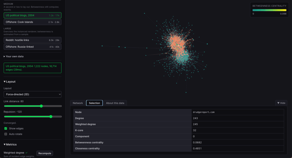
Clicking on nodes reveals reveals all the edges connected to a given node. Also, in the bottom info panel you can quickly see the underlying data of that node – in this case a website link, so that you can examine anomalies easily (oddly this is one of the things I found most frustrating in Gephi, is how many clicks it takes just to see the data inside a node).
Discovering communities
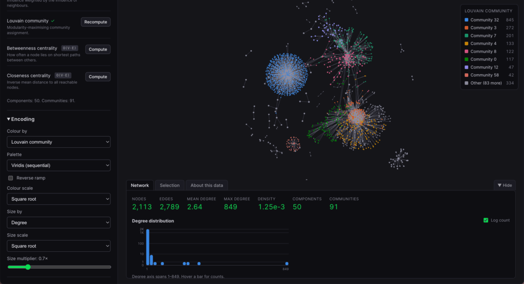
I’ve added some of the most common features and measures to the sidebar for dataset exploration. This includes centrality measures as well as Louvain Communitites. This allows for a quick way to examine factions within a network – and I think might be one of the most useful early exploration tools.
Future directions
There is a lot still to add to make this a more useful data analysis tool, but even in its current state I’m pleased with how natural and easy it feels to explore networks visually.
Next up is adding directional network support!