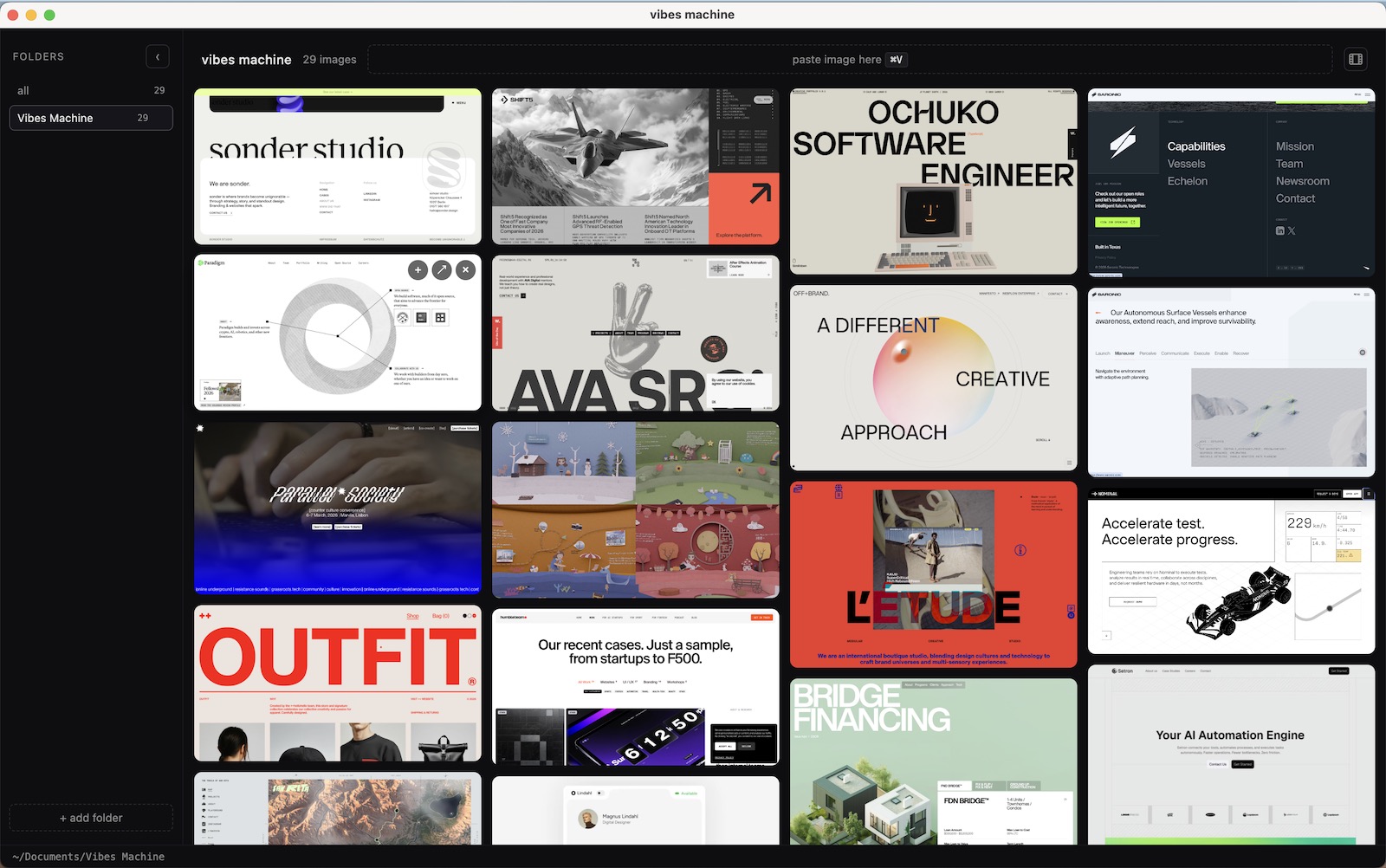
Vibes Machine is a small desktop app that points at folders of screenshots and reference images and shows all of them as a unified scrollable grid.
It came out of a habit I’d had for years, where I collected screenshots as design references, but never had a great way of re-accessing them as sources of inspiration.
The app itself is really just a viewer – it doesn’t import anything, it doesn’t copy your files, and it requires no database to keep in sync.
You point it at a folder, or several, and it renders the contents as a grid you can actually scan.
Why there’s no database
I built this without a database layer, because the folders on disk already are the library. A second copy would just mean keeping the two in sync forever.
Everything the app knows comes from reading the directory when it lists, so there’s no import step and nothing that can drift out of date.
The only thing it persists is which folders are linked, which comes out to about seven lines of JSON.
{
  "version": 2,
  "folders": [
    { "id": "a1b2c3d4", "path": "/Users/anton/Desktop/refs" }
  ],
  "activeFolderId": "a1b2c3d4"
}
The practical payoff is portability. The images stay in ordinary folders that Finder, Dropbox, and everything else on the machine already understands.
If I delete the app tomorrow the underlying library is completely unaffected.
Why it’s a desktop app
Anything in a browser would need me to upload the images first, and at that point there’s a copy, a server, and a database tracking both.
Electron gets me a window that can read a directory and render local files directly, which is the technical requirement here.
The tradeoff is that it’s a Mac app I run on one machine, and there’s no direct collaboration. I’m 100% okay with this, especially since you can pretty easily add collaboration with any existing file-sharing layer (e.g. google drive, dropbox, etc).
Why I don’t tag or sort anything
There’s no tagging in Vibes Machine, no nested folders, no ratings, and no search, and all of that is deliberate rather than unfinished.
This kind of complex organization is a cost you pay at save time – introducing friction into the process of curation. This also sets you up to funnel yourself into a direction early when later accessing for inspiration.
Instead the idea here is to create the easiest possible save process – eliminating friction at the curation step.
Then, when using for inspiration an unsorted grid is intentional, we want scan-ability and breadth, rather than complex search and filtering.
Adding something is one keystroke
Adding an image is ⌘V, and the paste lands in whichever folder is set as the write target, with the destination spelled out in the paste zone.
Dragging files in from Finder works too, and so does dropping them into the folder on disk, since the app watches the directory and re-lists when anything changes.
The limits are a 25 MB cap per image and the usual seven types (png, jpg, jpeg, gif, webp, avif, bmp), neither of which has come up in normal use.
Collections, one per project
Collections are the one organizing feature in the app, and they exist because gathering references for a specific project is a different activity from browsing.
Hitting the + on any tile adds it to a cart in the header, and I can drop the whole set into a new folder or into one that’s already linked.
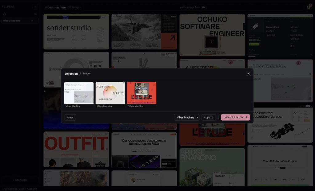
The important part is that it copies rather than moves, so the original stays where it was and the project folder gets its own copy.
That means one screenshot can sit in three project folders at once, without me deciding which one it needs to canonically belong to.
The collection roll is session-only and disappears upon exit, its simply meant as a way to bundle your inspiration in the moment.
What it isn’t
This isn’t a digital asset manager and would make a pretty bad one, since there’s no metadata, no versioning, no search, and nothing like a permissions model.